18 October 2024
I have been working in the field of business intelligence and data engineering for a long time. To make it this long, you have to be comfortable not feeling comfortable because the field changes all the time. The most obvious way is the tools we use in software to wrangle and visualize organization’s data is always evolving. The one constant, other than change, is that we’re always up against Excel. Recently, I was pulled into a conversation from a business unit that had built a process dependent on Excel. They found that they’ve outgrown Excel and needed something robust. As I was reflecting on that, I started to remember one of the most bizarre development tools that I’ve used in my career. What would you say if there was a tool that used an active Excel file for development of interactive dashboards that were output as a Flash file? Depending on how old you are, you might ask what is Flash? Or, you’d think I was crazy. That is exactly what Xcelsius was, which was later renamed to SAP Dashboards after a few acquisitions.
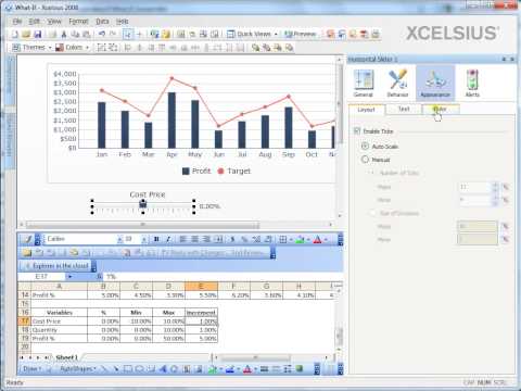
It’s hard to explain how crazy this program was without seeing it. Please look at this screenshot of the interface:

In the screenshot1, you’ll see a canvas, properties, and an Excel file tiled into one window.
The way Xcelsius worked is you’d design a dashboard with different visualizations. If you’re familiar with Power BI, it’s exactly like that. Linking those visualizations to data is where things went crazy. Dashboard developers would need to point the visualizations to various cells and ranges of the embedded Excel file. You could type in the data directly to Excel, but the software shipped with various connectors to bring in data. That data would have to be stored at a fixed location in the Excel file. This means you’d need to know exactly how much data you’d expect and there would be limitations based on older versions of Excel.
I came to Xcelsius after it was part of the SAP ecosystem2. I’d start by connecting the Dashboard to BEx queries from our BW system. So long as you knew what data was going to be coming (and that it would be pre-aggregated through the query configuration) that’s where things started to get crazy. At the most basic the visualizations would need data. However, there would be interactions that could be set. Say, if you click on one of the items of a chart you could set the chart to populate a cell or range of cells with the data that you clicked. With that populated, you could trigger other visualizations or queries to do other things. There wasn’t a concept of pages, but you could trick it by setting visualizations to be hidden by default. Depending on the user clicking on a visualization and data being populated in the embedded Excel file, you could then trigger visualizations to toggle their visibility.
The idea is interesting. Excel is the one constant in business and bringing in that familiar tool into a new visualization tool is a novel idea. The problem though is that it brings all the issues of an Excel file. You ahve to know how to design where the data goes. I remember trying to color code different ranges, but regardless of how well you do, you need to pray for good luck to even understand what the hell was developed the next time you go into the Dashboard to make changes. Of course, also pinning the output to a Flash file ultimately doomed it. Before I had left the SAP ecosystem, they were rolling out basic HTML5 support before finally putting the software on its sunset with the expectation that customers would transition to Design Studio which eventually appears to be renamed to SAP Lumira.
Though the tool was weird, I have a few interesting memories of things I built over a decade ago:
This was taken from a series of YouTube Videos posted 14 years ago because I doubt I could install this anywhere. ↩
Xcelsius was first created by a company named Infommersion in 2003. It was acquired by Business Objects in 2005, which was in term purchased by SAP in 2007. This was taken from Your Exit Strategy from SAP Dashboards/Xcelsius, a post from 2021! It goes to show that even though the field of data engineering changes all the time, it doesn’t mean that all businesses are on the cutting edge. Did I not say you need to be comfortable not feeling comforatble in this field? ↩